
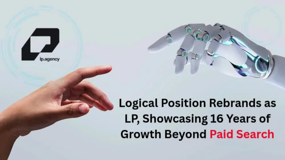
LP, formerly known as Logical Position, has introduced a new brand identity that reflects its growth beyond paid search into a broader digital marketing agency. The company announced the name change after 16 years of expansion and evolving client needs.
The company, known as Logical Position, was initially started in Beaverton, Oregon, with just three employees working out of an office that covered 900 square feet. The company has now become one of the country’s largest digital marketing agencies, employing hundreds of people.
“When we started, Logical Position described exactly what we did: helping businesses find the most logical place for their ads on Google,” said Eric Scriven, CEO of LP. “But we’re doing so much more with our clients today, and hearing how their relationship with us has evolved reinforced that we had outgrown the name. LP feels true to our history while better reflecting who we are now and where we’re going.”
LP Expands Beyond Its Paid Search Roots
Over the years, LP has expanded its offerings to meet changing marketing needs. The agency now provides PPC, SEO, paid social, Amazon advertising, email and SMS marketing, and website development. These services support more than 10,000 clients.
On the other hand, the rebranding gives the acronym LP the official title of the organization. This move came after a process of brand discovery in which the company engaged its clients in discussion.
Their comments pointed out that the scope of work for the agency had increased beyond the mere execution of marketing. The LP group assists their clients in making business decisions like launching a product or adopting technology.
As a result, the new identity reflects the company’s broader role in supporting business growth. It also positions LP to represent its expanding services and client relationships more clearly.
Company Preserves Its Original Brand Symbol
Despite the name change, LP will retain an important element of its visual identity. The upward-right arrow has appeared in the company’s logos since 2010 and remains part of the new branding.
“Some things you don’t need a brand discovery process to tell you,” Scriven said. “The arrow has always represented where we want our clients to go: forward and up. That isn’t changing.”
Thus, the new brand keeps the company’s existing symbol but updates its name. In doing so, LP seeks to integrate its sixteen years of history with its present-day offerings and future path.
Want more marketing excellence stories? Visit MarTech News for insights, trends, and expert updates.
News Source: Businesswire.com